Defense against dishonest charts
Data visualizations can be misleading because charts are not objective facts but interpretations shaped by choices in design and context. Readers must stay skeptical, examine scales and sources, and understand the intent behind the data presentation. To combat dishonest charts, one should scrutinize the details, question the narrative, and actively correct misinformation.
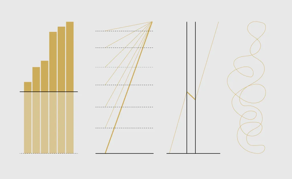
- ▪A single dataset can support multiple narratives depending on visual encoding and scale.
- ▪Dishonest chartmakers exploit assumptions that readers will not examine context or details.
- ▪Colorful visuals and bold titles can mislead if not interpreted alongside scales, units, and background information.
- ▪Surprising data findings should prompt skepticism and further investigation into the 'who, what, when, where, why, and how' behind the chart.
- ▪Leaving misleading charts uncorrected allows them to spread, much like weeds overtaking a garden.
Opening excerpt (first ~120 words) tap to expand
Reading Data Visualization lets you see data quicker than if you were browsing a spreadsheet, and for many, a better chart means it takes less time to read. Dishonest chartmakers use this assumption to their advantage. They publish any message they want and know that only a fraction of readers think long enough to learn the context of a data point. Sometimes readers catch on, but the dishonest find new tricks. So while it is useful to know misleading varieties, it is better to establish a general approach for reading data. Recognize the possibilities. As we’ve seen in previous examples, a single dataset can represent infinite narratives, depending on the angle you look from. A choice of visual encoding and a shift in scale can make something good look bad.
…
Excerpt limited to ~120 words for fair-use compliance. The full article is at FlowingData.
Discussion
0 commentsMore from FlowingData